Accessibility statement
Go behind the scenes with me.
This site is a reflection of my values and commitment, where every choice was shaped by care, intention, and my belief that access is for everyone.
My commitment
This isn’t just a website. It’s a digital reflection of the whole Andraéa. Every image, word, and access choice was made with intention—so that you don’t just read about my values, you feel them. From culture to creativity, I want visitors to experience a space that holds complexity, joy, and care. As the elders might say, I hope you leave just a little better than you came.
It takes a village to make a site like this possible.
Deep gratitude to everyone who brought it to life:
- Website Co-Design/Development: Easy Surf
- Copywriting: Francesca Phillips
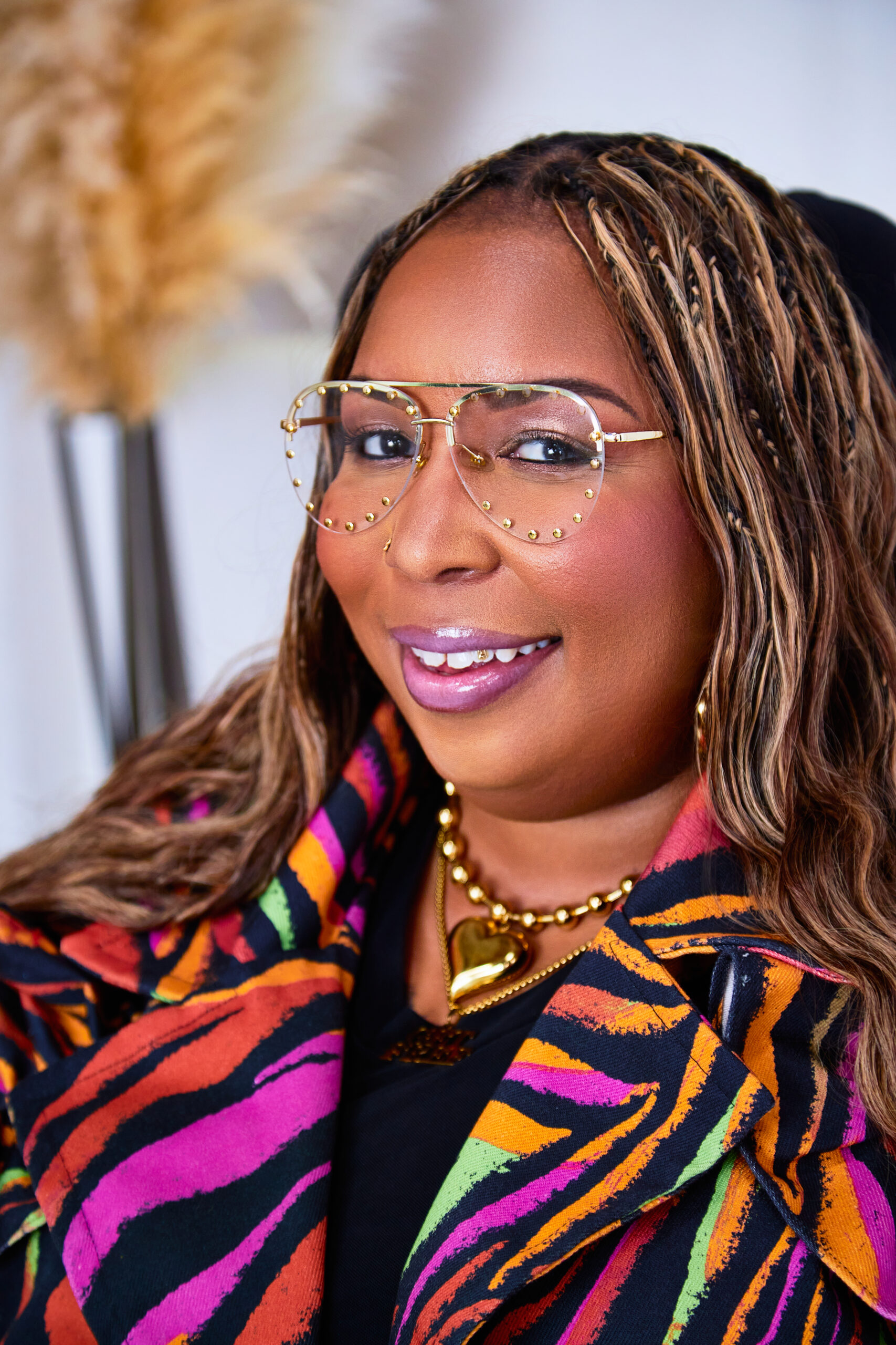
- Photography/Creative Direction: Dark Flower Studios
- Makeup: Aced Faces
- Styling & all-things-creative partner: My wife, Jamie LaVant-Terry


Designed with
intention
Designing this site meant designing with intention. From typography to color, every visual choice reflects both my personal style and unwavering commitment to access.
I chose the typeface Red Hat Text because it felt balanced—distinctive, expressive, and, according to recent research from the Readability Group, one of the most accessible free (YES! FREE!) Google Fonts out there.
Body text size is set at 26px—because legibility matters. Even the smallest text is a roomy 18px.
Colors? I chose them for their vibrancy and power as tools of self-expression—but never at the expense of accessibility. Every combination was tested to meet, and often exceed, WCAG AA and AAA contrast standards.
Focus indicators weren’t left to browser defaults. Each one was intentionally designed to be visible, high-contrast, and stylistically cohesive—because keyboard users deserve a seamless, stylish experience, too.
And when it came to image descriptions, we took our cues from Alt Text as Poetry approach by Bojana Coklyat and Shannon Finnegan, treating alt text not just as a technical requirement, but as another space for expression and care.
Developed for
everyone
I teamed up with Easy Surf, a disability-led digital accessibility consultancy, to build a site that reflects both intention and impact.
From the start, we centered the perspectives of people with disabilities, making sure real lived experience shaped how the site works, not just how it looks. The website was also built to WCAG 2.2 level AA standards.
Easy Surf built it to be responsive across screen sizes and work seamlessly with assistive technologies like speech recognition, screen readers, and magnification.
We leveraged the WordPress Twenty Twenty-Four theme—making thoughtful decisions to prioritize accessibility throughout.
We used native HTML whenever possible because it’s built for access when used right—clean, semantic, and ready to communicate with screen readers and other tools. Nothing fancy just to be fancy.
This wasn’t just about building a website—it was about bringing accessible design to life with intention. The result is something refreshingly simple, grounded in what works, and built to welcome everyone in.
Your feedback matters
Let me know what’s working—and what’s not. I’d love to hear from you.